Color is one of the most powerful design elements in any artwork—and it can completely transform the mood of a room. Whether you want to create a calming sanctuary, an energizing living space, or a warm and inviting atmosphere, the colors you choose in your artwork will shape how the room feels the moment someone walks in. Understanding how color influences emotion allows you to curate art that not only looks beautiful but also enhances the energy of your home.
If you’re exploring art to complement specific color palettes or emotional themes, browsing curated collections on sites like MusaArtGallery is a great place to start.
The Psychology of Color in Art
Every color carries emotional weight. Even subtle shifts in hue, saturation, and brightness can influence mood. This is why selecting artwork by color is just as important as choosing it for style or size.
Warm colors such as red, orange, and yellow often evoke excitement, joy, and warmth. Cool colors like blue, green, and purple tend to bring relaxation, calm, and serenity. Neutrals—including black, white, gray, and beige—create balance, simplicity, and sophistication. By understanding how colors behave, you can intentionally shift the atmosphere of any room.
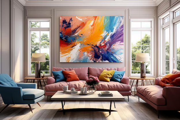
Using Warm Colors to Energize a Space
Warm colors make rooms feel lively and vibrant. Shades like deep red, burnt orange, and golden yellow add energy and movement, making them ideal for social areas such as living rooms, dining rooms, and entertainment spaces.
Artwork with warm tones encourages conversation, creativity, and positivity. If your home feels a little too quiet or neutral, a warm-toned piece can instantly brighten the space and add character.
Creating Calm with Cool Tones
Cool-colored artwork is perfect for spaces meant for rest or reflection. Blues and greens evoke feelings of tranquility, while softer lavender or muted teal can create a soothing environment. These tones work beautifully in bedrooms, reading corners, meditation areas, and bathrooms.
Cool colors also help visually expand small rooms by creating an airy, open feeling. A large abstract in cool hues can soften harsh architectural lines and bring visual peace to a space.
Neutral Tones for Elegance and Balance
Neutral artwork brings versatility and timelessness. Black-and-white art, taupe abstracts, or minimalist beige compositions enhance a room without overpowering it. These tones pair effortlessly with any interior design style—from modern and minimalist to traditional and rustic.
Neutral artwork is also ideal if you frequently switch up decor, as it adapts to nearly any palette. A monochrome piece can provide a grounding focal point that balances brighter elements in the room.
Embracing Bold Colors for Personality
Bold, high-contrast colors are perfect for homeowners who want their space to reflect confidence and individuality. Vibrant pinks, electric blues, or saturated greens make unforgettable statements, turning artwork into the room’s defining feature.
A bold-colored piece works well in modern interiors that rely on clean lines and simple furniture, providing the dynamic element that ties everything together.
Yellow: The Mood-Lifting Color
While all colors carry emotional associations, yellow is one of the most uplifting. It symbolizes optimism, creativity, and warmth. Even a small pop of yellow in artwork can brighten a space and make it feel more welcoming.
If you’re looking to introduce cheerful, sunlit tones into your interior, explore MusaArtGallery’s curated yellow art collection. From soft pastels to vibrant golden hues, these works bring instant joy and brightness to any room.
How to Choose the Right Color for Your Room
When selecting artwork based on color, think about how the room currently feels—and how you want it to feel.
If your room feels:
- Too cold → Add warm tones like red, orange, or yellow.
- Too busy or visually loud → Introduce neutral or cool-colored artwork.
- Too bland → Choose bold, contrasting colors that create visual excitement.
- Too dark → Opt for lighter, brighter artwork with soft or vivid highlights.
Also consider the existing palette of the room. An artwork’s color should complement the space rather than clash with it. Sometimes the right piece unifies scattered colors in the decor; other times, it provides the pop of contrast that brings balance.
Mixing Colors for Depth and Interest
You don’t need to stick to a single color family. Many powerful artworks combine multiple colors to create emotional layers. A painting with warm and cool tones together can energize a room while still feeling grounded. Mixed-color artwork also works well in eclectic or transitional homes where the design style blends influences.
If you choose mixed-color art, repeat one or two colors throughout the room through pillows, throws, or accessories to create cohesion.
Final Thoughts
Color is one of the most effective tools for shaping emotion within a home. By choosing artwork with intentional color palettes, you can energize, calm, brighten, or soften any room. Whether you’re drawn to serene blues, bold reds, elegant neutrals, or cheerful yellows, the right artwork color will help express the mood you want your space to embody.